
WristCheck v1.5 Release Notes Link to heading
Opps - I seem to have skipped writing up notes when I released WristCheck v1.4! (and for the last couple of Air Fryr releases…) I’ll add a quick summary at the end!
But onto the details - WristCheck 1.5 is a fairly big update to the user interface of the main watchbox view. I’ve made search more prominent, given a use the ability to re-order the watch display, included images on the main page (so that you can find the watch you’re looking for visually) and made it easier to jump between the various watch box views (i.e. the wish list and sold watches lists).
Let’s go through these to summarise the main changes…
Redesign of the Watch Box UI Link to heading
The original view presented in WristCheck was just a sterile text only list of watches, with an expanding accordion tile at the top that hid links to search and the secondary watch box views… I was never particularly happy with this view. When I was getting stuck into using Flutter I had issues with getting images onto the tiles without them messing up the various dimensions, and I just could not get the view to refresh as I wanted when the database filters were changed, hence creating separate individual pages for the sold watches and wishlist views.
But a year or so into my adventures with Flutter I’m now much more confident with it’s capabilities and how the various widgets interact with each other… so it felt like a good time to rebuild the homepage!
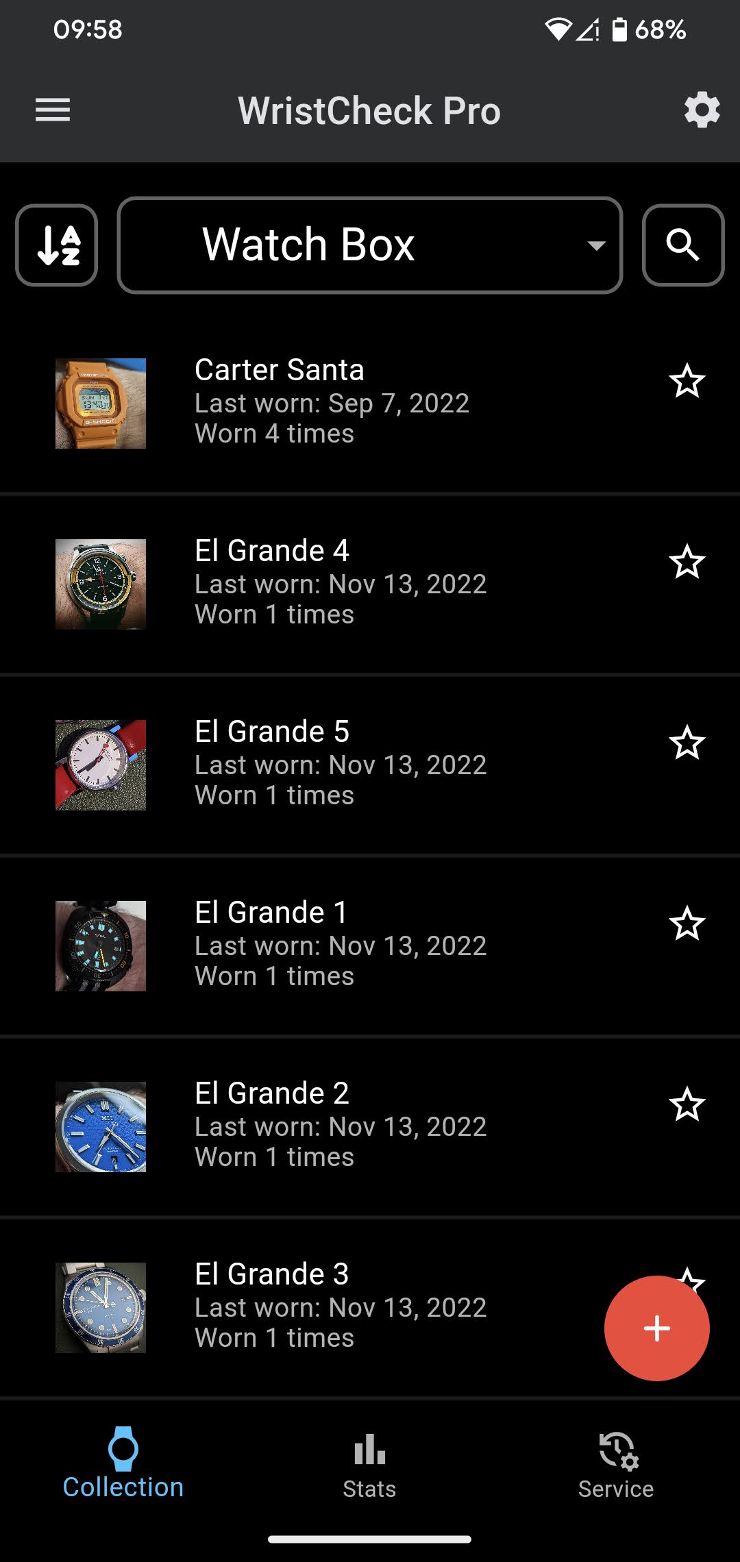 The new user interface!
One major update is the addition of the drop-down picker at the top of the page - you can now move from your watch box, to wish list, to list of sold watches or directly to a random watch by selecting from the dropdown and the page will instantly refresh to display your selection! No more navigating to different pages!
Search is more prominent Link to heading
From a quick look at the image above you’ll see that the ability to search your collection is no longer hidden away - it’s always right there in the top right of the home screen.
From the start I wanted WristCheck to work well for users with large watch collections - a common complaint I heard about other apps was that they started to slow down or got to a point where it was just too hard to find the watch you wanted once you’d added so many, so a quick and easy real-time search option was a must - I’m super happy that this is now easy to find and right in front of the user!
Quickly re-order your collection Link to heading
Previously the watches always appeared in the list in the order you added them to the database… which was fine, but not the best experience… whenever you got a new watch, it would always be the last one on the screen!
Now I’ve added the ability to re-order the collection on the fly, using one of several options (I restrained myself to avoid overdoing it, but if something is really missing shout out in an app review!)
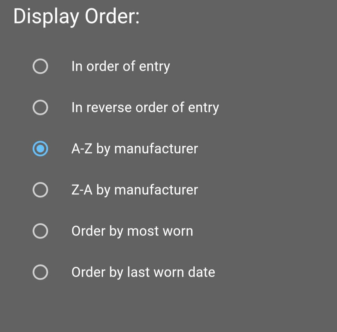 Quickly re-order your collection!
Since moving the release from my test device to my day to day phone I’ve found this fantastic! I like to show my collection by last worn date, so my recently worn watches are always at the top (and when I wear something different from the previous day it’s nice to see the page refresh itself!)
Watch images in the main view Link to heading
Another long overdue, and often asked for feature! The watch list now shows a small thumbnail of the watches! Again this turns out to be really useful for quickly finding the watch you’ve just put on when you go in to track what you’re wearing, and has been something I’ve been meaning to figure out for ages…
…but that’s not all!
Grid or list view Link to heading
I mentioned at the start of this post that the original watch view was just a fairly sterile list of watches… and I’ve just mentioned that that sterile list now includes an image of the watch… but what if you want more?
Well, now you also have the option to change the default view to a grid view, with larger pictures!
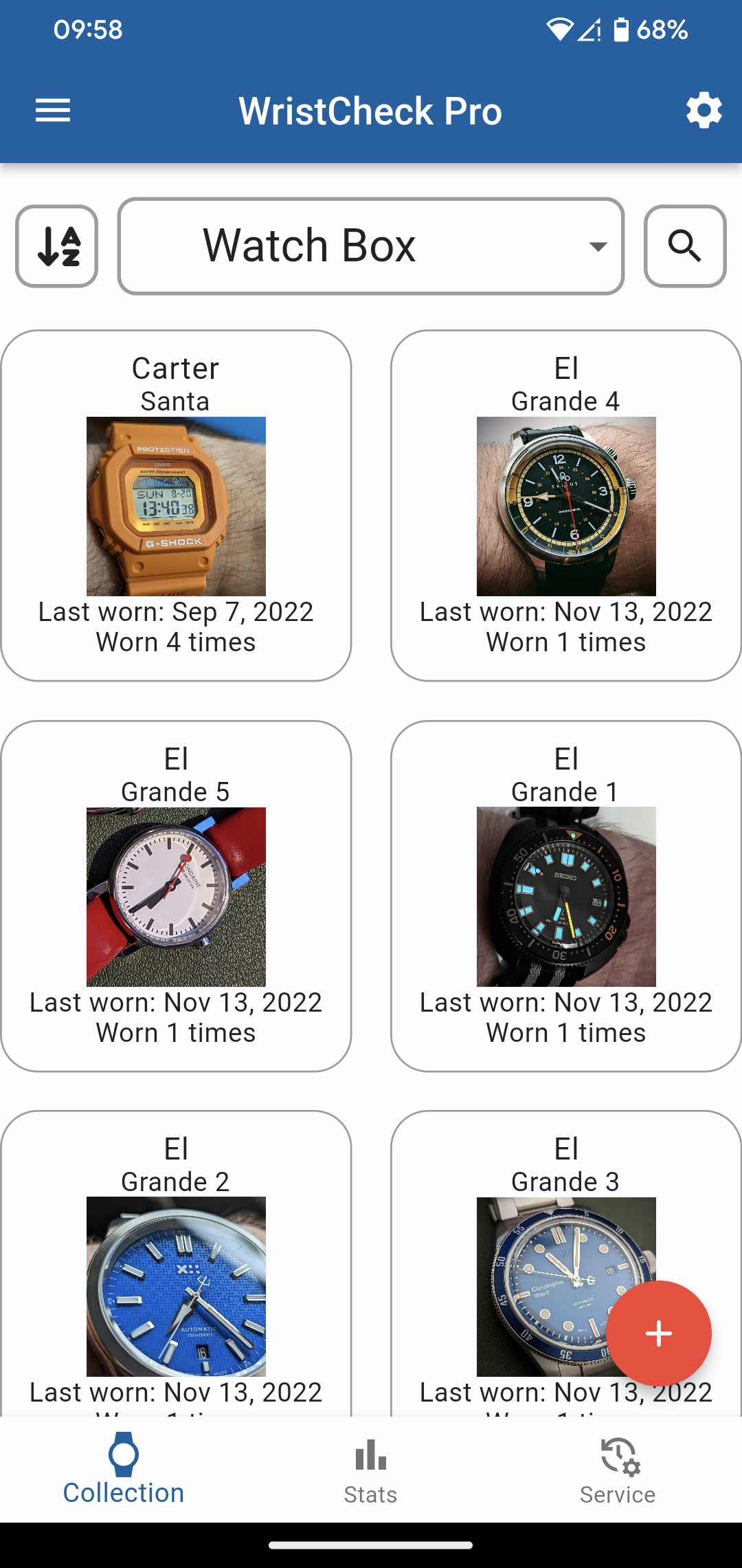 Display your collection in a grid view!
I should call out that this viewing pattern doesn’t work well on very small screens - if your screen is too small then the watch names (neatly) truncate, and the wear dates may be hidden behind the box border! But it works well on most modern phones!
Personally I love this view - I’ve found myself using it day to day over the original list view!
“Minor Improvements” Link to heading
The last piece of the puzzle for v1.5 is hidden away! Google now request that developers target the latest version of Android, so had requested I ensured my SDK target was updated to level 33…which I’m sure sounds rather boring, but as part of this I also updated the underlying Flutter version I was using and updated some of the libraries the app makes use of to function - all hidden away under the hood, but hopefully it’ll make for a smoother app experience!
What about version 1.4? Link to heading
I mentioned at the start that I’d forgotten to provide an update when I release WristCheck v1.4, so figure I’ll add a quick update here to close out the post.
Version 1.4 was probably the most important release of the app since I launched it, as it included integrating the RevenueCat SDK to allow me to set up some simple in-app purchases within the app - this really deserves it’s own separate post (as I also integrated this into Air Fryr). I’ll write up a full post about monetisation (as a follow up to my previous advertising revenue one), but from a WristCheck point of view, the key change in v1.4 was the ability for a user to choose their own price for the app to become ad-free.